When taking on a design project for an Airbnb, I like to decorate each bedroom differently. But they also need to be cohesive with the rest of the house. Instead of using themes (because that sounds cheesy:), I give each room a brand identity. In a recent vacation rental home project, I gave my clients a few different brand identity concepts I came up with. In the end, we decided to decorate each room to relate to something in Michigan. They had just purchased the home when we met, and the previous owners left some of their furniture. Upon our first meeting, all of the bedrooms already had beds and dressers, so the style of furniture dictated which brand identity that was going to be used in each room. This home was built in 1908 and at some point someone painted the wood paneled walls white, so we refreshed them with new colors, in keeping with the home’s style and era. We kept the hardwood floors, ceiling, windows and trim their original stain.
There are five bedrooms and a loft that is used for extra guests. The identities we came up with are the Great Lakes, Auto, Upper Peninsula, Agriculture, the Four Seasons and the loft is Sports. As these “themes” went through the design phase they morphed into something other than first imagined (more on that in future posts) so that they all worked together. Which is why you need a plan before you start so that things can change as needed with out worrying that you already spent money! They knew they wanted to have one bedroom that was more masculine, one bedroom that was more feminine and the others to be more neutral.
This was a DIY style project. What that means is I designed, but my clients did all of the ordering, receiving and installing of everything I selected for them. This took several months as it was a huge house. There were no renovations to be done, just furnishings and paint. Which made this an excellent DIY project.
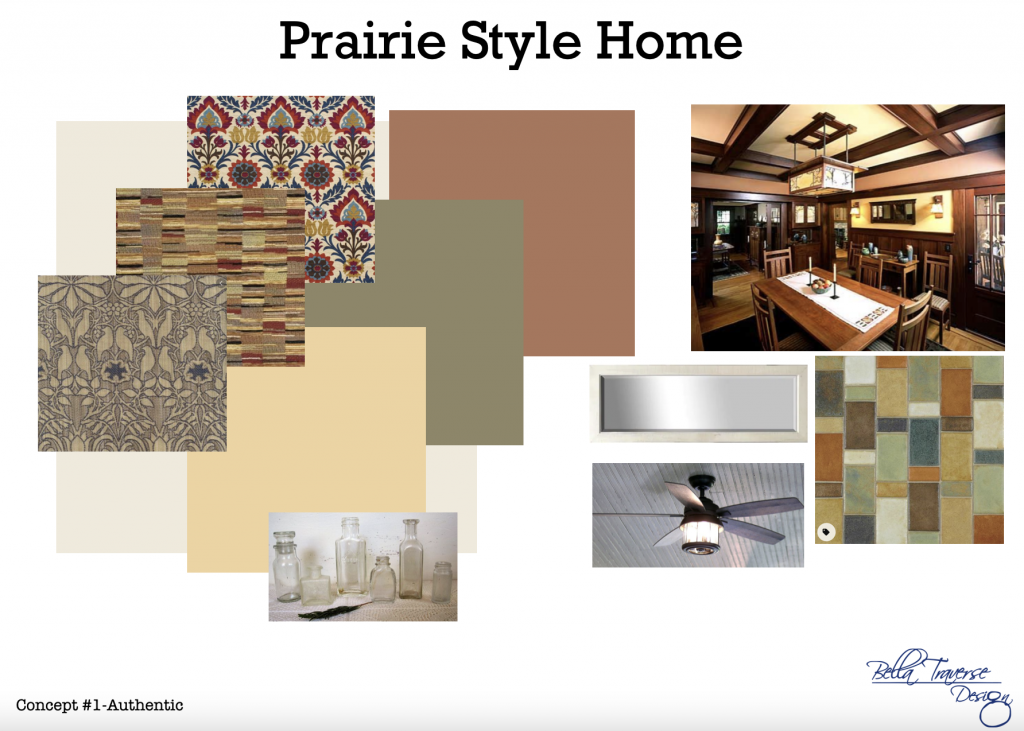
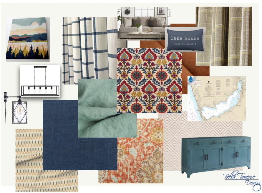
When I start a new project with a client whether it’s a full home renovation, vacation home or an Airbnb, we first start with a concept. It is important that I have a good sense of what their style is. Sometimes (almost always) they explain what they want one way, yet show me samples of something completely different. Most of my clients are couples so often times one of them interpret the style one way and the other the another way. It is my job to clarify their needs and wants and merge these two into one. For this home we started with these two concepts. One of them envisioned something more authentic and the other something more updated and coastal. Either way, with a historical home, you have to (or at least you should) keep within its original architecture and style.


The traditional style on the left is what the husband envisioned, while the style on the right is what the wife envisioned. So I merged the two and this was the result:

We used historically accurate colors, but made sure they also fit with an updated and coastal feel. We updated things that were “removable” such as the furniture, artwork, accessories and light fixtures. While leaving the permanent fixtures intact such as the dark wall paneling, architectural millwork, cabinetry and hardwood floors.

Even though this series is about the bedrooms, this photo of the living room helps to show the overall concept of the house.
Have you been thinking about updating your Airbnb? Now is a great time! The leaves are falling and the sun has set on the Michigan summer season. You can click on the link below to book a time slot for your FREE 15 minute Discovery Call. Don’t wait! We only take on a limited number of clients, so that you can get the time and focus you and your project deserve.
https://bellatraversedesign.com/services/


