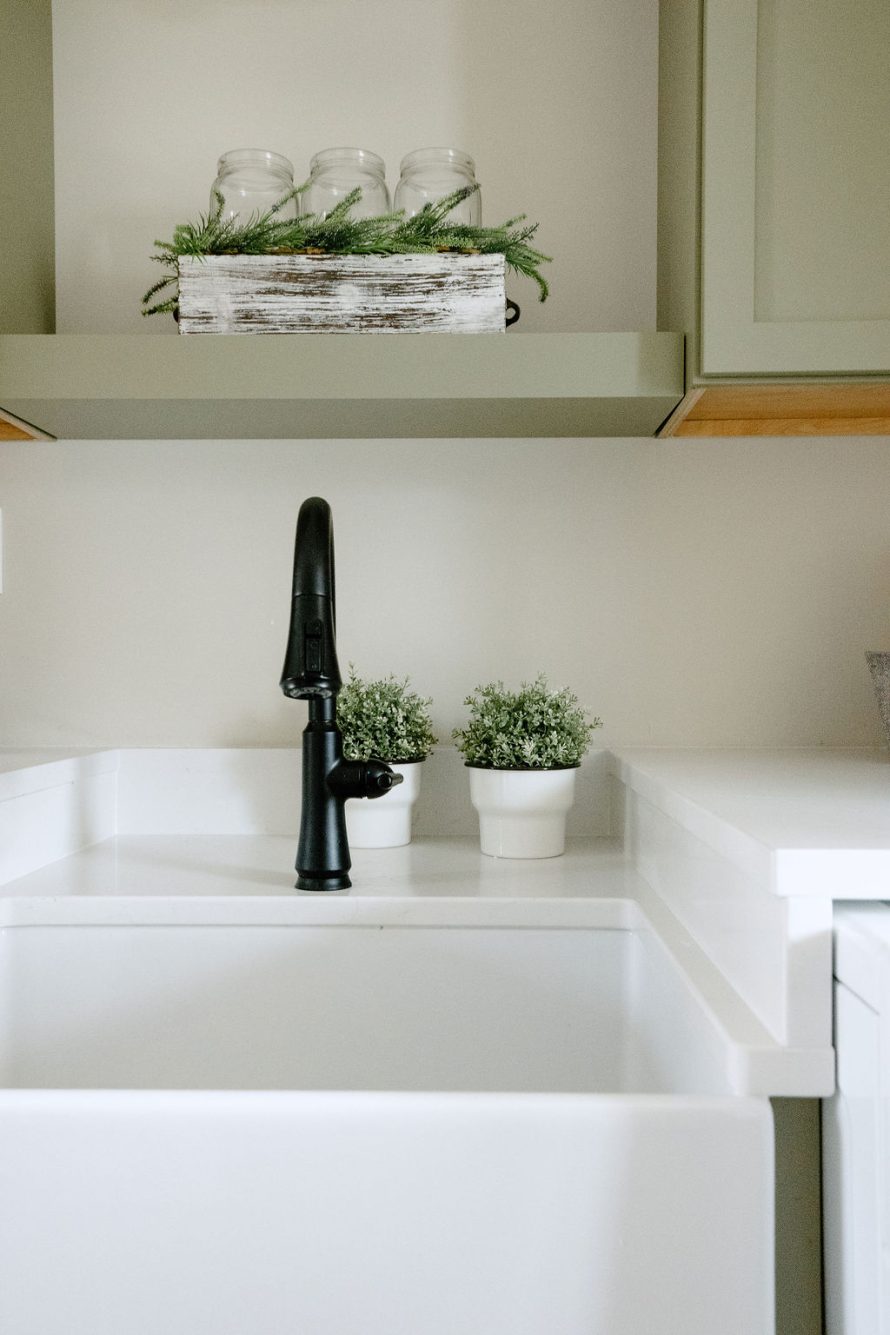
I just love homes from this era. They are not so old that the electric, plumbing or foundations are outdated or failing. But they are old enough that they need cosmetic updates and possibly some space planning changes. This laundry is an excellent example.
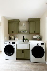
The layout was such a waste of space before. The washer and dryer were apartment sized and stacked at one end, with a small sink on the other. Then there was a lazy susan in the corner (no one wants that) and a 12” void between that cabinet and the sink cabinet because of the angled wall.
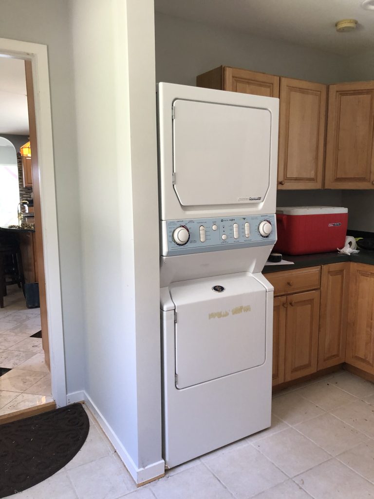
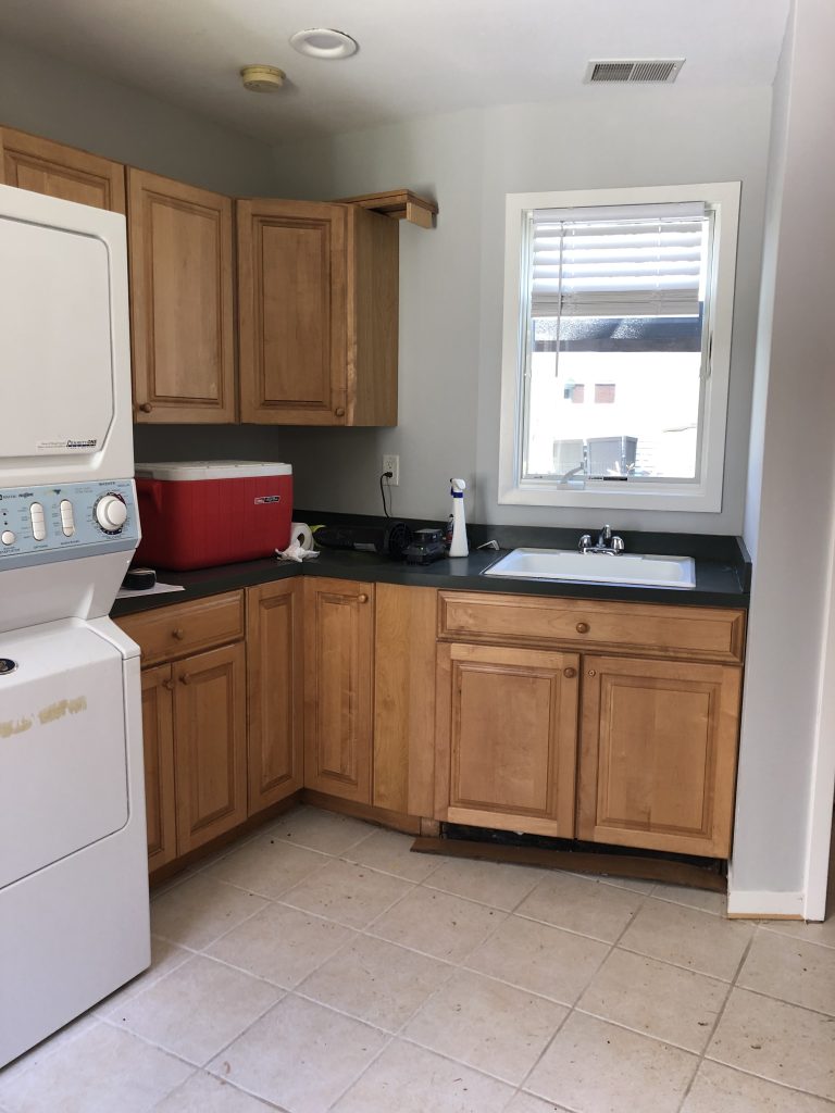
Step one was to envision the space so that the award angles were not a hinderance to the function of the room. We also did not want to have to move the plumbing for the washer, so ideally we wanted that to stay to the left side.
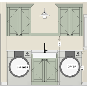
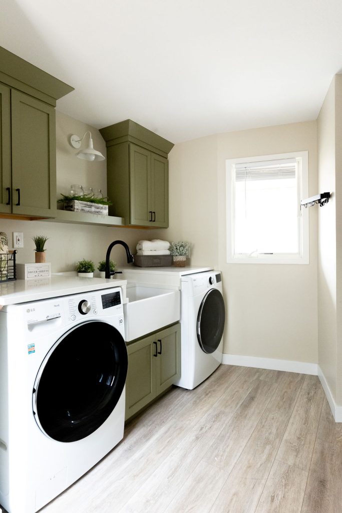
Our client really didn’t like the look of the utilitarian laundry room sinks. Neither do we! She wanted something more stylish than an average kitchen undermount sink, but loved the look of quartz countertops. Enter the farm house sink! Because of the depth and height of the washer and dryer, we pulled the cabinet the sink is housed in forward, and had our countertop fabricator custom build the top, backsplash and side splashes to so that the appliances and sink were built in
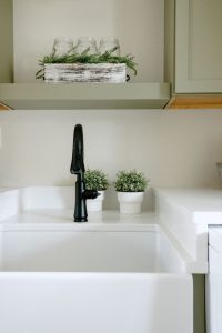
Next I reimagined this room with taller wall cabinets for storage in a beautiful green paint. They are finished with a custom stacked crown molding to elevate the room. The floating shelf in the middle ties them together, with a space for decor and a gooseneck sconce.
Finally we installed a collapsing hanging rack that folds out of the way when not in use. A traditional folding rack wouldn’t work as well, because if someone is using the dryer, they would run right into it. This option can be folded in multiple directions so it can swing out of the way.
Follow along for other rooms we remodeled in this lake home in West Michigan.


